These are some logos I have looked at and evaluated saying what I think the cons and/or why they are good and suit their purpose.
The first logo I looked at was the Nike tick. This logo has established a iconic logo for Nike over the years of being out, which has means they do not have to put their name under it. the Nike tick its self is sleek , smooth and sporty, having a completely different look from a tick with sharp edges. it also imply's and subconscious says this product ticks all the box's too consumers. Because of the simplicity of this logo it is easy to adapt this logo, just changing one colour making the logo look different for example putting pink or a baby blue for women marketing or red or a dark blue for a male market, there are also natural colours like white and black if aiming at both or if the product is indifferent.
I think that this logo is good, remember able and also has a meaning behind it, which is what I believe you would want in a high grade logo.
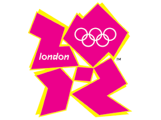
The second logo I looked at was the logo that has be chosen for the London 2012 Olympics. This logo does not do much for me , I do not find it very attractive and find it inappropriate for its purpose. The Olympic Rings which is included which shows its related to the Olympics and I believe is standard or essential in an Olympic logo's. the logo its self doesn't show anything which would be considered English . the Logo shape its self its weird. nothing really related to the country or event.
It also looks like it would be something found in a techno scene or club .nothing about this logo screams i'm a sport event or i'm in London or even that its part of the Olympics. apart from the obvious rings which are tiny on the logo itself.
The colour scheme isn't very effective either being a bit tacky and just not very attractive colours for contrast.
In my opinion this logo isn't good and is a bit of a fail for what it is for.
The Third logo I have reviewed is the Coca Cola Logo.
The ice at the top is the first , this to me makes it looks like the drink will be refreshing and its possible that it was also added to add a second meaning like i'm cool.
the colour scheme is very iconic now seeing the red on a drink will usually bring up the thought of coca cola. and it also adds a festive look for Christmas making look like a festive or traditional drink.
The text also plays on this fact, the font type being unique all smoothed edged implying its a smooth to drink and a clean white colour which possibly means it has a pure taste.
They also have a bottle in the back ground which is in a glass looking bottle with a bottle top on it, this also plays on traditional and iconic things . being most bottles are plastic now.


