The internet is one of the major advances for photography allowing people to show their pictures to people all over the world and set up pages so people can browse through and buy or show interest in the images they have taken .
Things like facebook, twitter deviant art and other websites have allowed them to share,
Wednesday, 2 February 2011
Tuesday, 1 February 2011
Createing 3d Images
To create a 3d image you need to :
- get an image you wish to make 3D
- Duplicate the image
- rename one to red and the other too blue
- go onto named BLUE layer
- select image -> adjustment -> Curves
- click the box and then bring down the tab and click RED
- Change the Output number to 0 and the Input to 251.(this should make the image have a blue/teal colour.
- Now click the eye to hide the blue layer
- Now click the RED layer
- select image -> adjustment -> Curves
- click the box and then bring down the tab and click Green
- Click the out put and change to 0 and the input to 251 (should make the image purple)
- Then bring down the tab again and change it to BLUE
- Change the output to 0 and the input to 251(this should make the image red)
- Now unhide the blue layer and change the blending options (it should say normal it is next to opacity)
- Bring down the tab and you should see screen , select this.(it should make the picture look like original did.
- Now move the blue screen slightly in a direction and it should make a funny effect .
- Now put on your glasses and admire the 3d.

This is a character which i wanted too see if i could make look slightly 3d , it did not work to great. more of a shadow added added around him .

This one on the other hand was a bit more successful then the other it added some depth and to me made it lok like you where realy looking up some steps, to some extent.
Wednesday, 19 January 2011
My own logo designs
I decided on the colours for the logo before I started and I choose green and blue because of the contrast and how rich the colours can be. also they arnt to much when you look at the and are eye grabbing colours.
These would be possibly the banner and the logo. or just the logo which will be placed in the left of the web site.

First design for My logo.

Robert Capa
A photographer i found was Robert Capa who took photos of things that would normally not be seen, like the second world war, or the Spanish civil war
(Wiki Source)
Capa's first published photograph was of Leon Trotsky making a speech in Copenhagen on "The Meaning of the Russian Revolution" in 1932.
At the start of World War II, Capa was in New York City. He had moved there from Paris to look for new work and to escape Nazi persecution.
The war took Capa to various parts of the European Theatre on photography assignments.
He was original hired by Collier's Weekly to take photographs, he was then fired and was hired by another called Life
He was the only "enemy alien" photographer for the Allies. On October 7, 1943,
Robert Capa was in Naples with Life reporter Will Lang Jr. and photographed theNaples post office bombing.
Some of the images I found extremely unique exciting and enjoyed looking at where.

 I find these images have more than just the picture, and also give a slight feel of what it might of been like when you where their. the blur on the second image makes it look like everything was moving fast.
(Wiki Source)
Capa's first published photograph was of Leon Trotsky making a speech in Copenhagen on "The Meaning of the Russian Revolution" in 1932.
At the start of World War II, Capa was in New York City. He had moved there from Paris to look for new work and to escape Nazi persecution.
The war took Capa to various parts of the European Theatre on photography assignments.
He was original hired by Collier's Weekly to take photographs, he was then fired and was hired by another called Life
He was the only "enemy alien" photographer for the Allies. On October 7, 1943,
Robert Capa was in Naples with Life reporter Will Lang Jr. and photographed theNaples post office bombing.
Some of the images I found extremely unique exciting and enjoyed looking at where.


Tuesday, 18 January 2011
Typography maker
Today we had to do the work and put it up on the wall which involved a website which make a typographical image by you inputting the words for it.By giving a link or typing in sentence's it creates a typographical image for you.
we had to do one for our self and one for someone else
here is what I made for my self.


we had to do one for our self and one for someone else
here is what I made for my self.


The bottom one was someone else in the class.
Wednesday, 12 January 2011
My Logo And Banner
These are the two things i choose which will represent the title of the company and the logo .
i choose thies form the rest cus they looked more refine, simple but easy to produce.


This is my Miniature logo which will be placed into the top left of the corner in the website which which the majority of websites have. this is a shortened down bit of the shop name

this the the banner for my website which would be placed at the middle and top of the screen showing the full shop title. it will also contain the shop colours , which i choose to contrast and attract attention.
Wednesday, 15 December 2010
Logo's opinion.
These are some logos I have looked at and evaluated saying what I think the cons and/or why they are good and suit their purpose.
 The first logo I looked at was the Nike tick. This logo has established a iconic logo for Nike over the years of being out, which has means they do not have to put their name under it. the Nike tick its self is sleek , smooth and sporty, having a completely different look from a tick with sharp edges. it also imply's and subconscious says this product ticks all the box's too consumers. Because of the simplicity of this logo it is easy to adapt this logo, just changing one colour making the logo look different for example putting pink or a baby blue for women marketing or red or a dark blue for a male market, there are also natural colours like white and black if aiming at both or if the product is indifferent.
I think that this logo is good, remember able and also has a meaning behind it, which is what I believe you would want in a high grade logo.
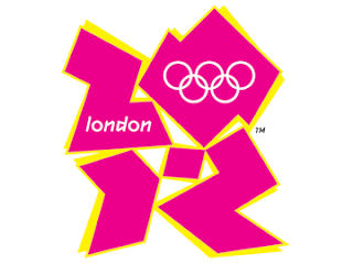
The second logo I looked at was the logo that has be chosen for the London 2012 Olympics. This logo does not do much for me , I do not find it very attractive and find it inappropriate for its purpose. The Olympic Rings which is included which shows its related to the Olympics and I believe is standard or essential in an Olympic logo's. the logo its self doesn't show anything which would be considered English . the Logo shape its self its weird. nothing really related to the country or event.
It also looks like it would be something found in a techno scene or club .nothing about this logo screams i'm a sport event or i'm in London or even that its part of the Olympics. apart from the obvious rings which are tiny on the logo itself.
The colour scheme isn't very effective either being a bit tacky and just not very attractive colours for contrast.
In my opinion this logo isn't good and is a bit of a fail for what it is for.

The Third logo I have reviewed is the Coca Cola Logo.
The ice at the top is the first , this to me makes it looks like the drink will be refreshing and its possible that it was also added to add a second meaning like i'm cool.
the colour scheme is very iconic now seeing the red on a drink will usually bring up the thought of coca cola. and it also adds a festive look for Christmas making look like a festive or traditional drink.
The text also plays on this fact, the font type being unique all smoothed edged implying its a smooth to drink and a clean white colour which possibly means it has a pure taste.
They also have a bottle in the back ground which is in a glass looking bottle with a bottle top on it, this also plays on traditional and iconic things . being most bottles are plastic now.
Subscribe to:
Posts (Atom)